RANKING THE LOGOS AND TEAM NAMES OF SASL
| RANK: | LOGO: | TEAM NAME: | |
| 1 | 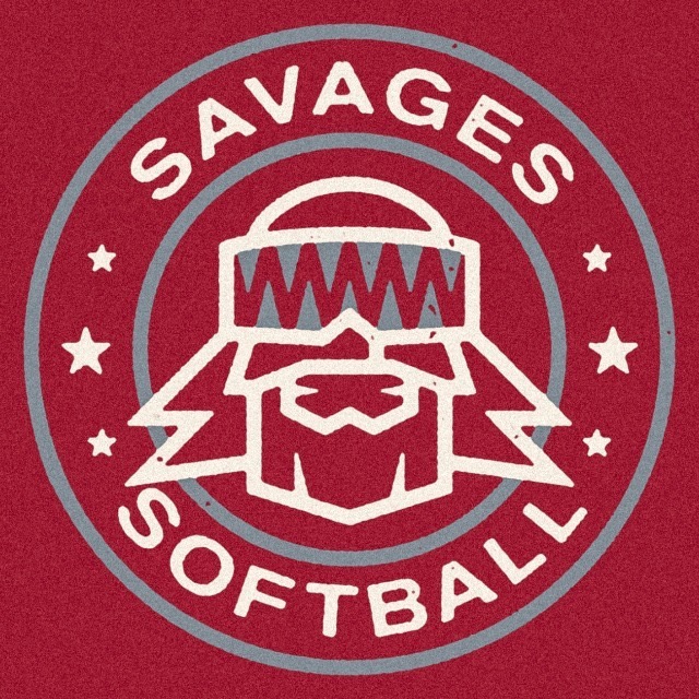 |
SAVAGES | 2019 Savages went away from their Navy and Orange colors. They decided to go with a Crimson base with some gray and white. We think the unique logo still stands out as the best in SASL. |
| 2 | 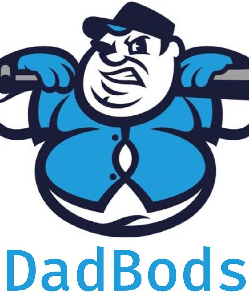 |
DAD BODS | The rookie team joined National League and immediately made a name for themselves with one of the best team names in SASL history. The logo is humorous. We would have liked a better font in the logo and something more menacing. This guy just looks like he is constipated. |
| 3 | 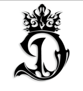 |
DYNASTY | The oldest remaining franchise in SASL still shines with a classy logo and team name. The simple yet spectacular look is timeless and the Dynasty Red uniforms are recognizable any Sunday. |
| 4 | 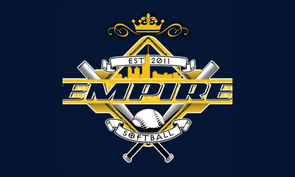 |
EMPIRE | Empire has two of the best color combinations in SASL in Navy and Gold. Their jerseys are also classics and the team has been around since 2011. Well done by Faizal and co. keeping the franchise hungry every season. Don’t change the colors, the logos and the uniforms! |
| 5 | 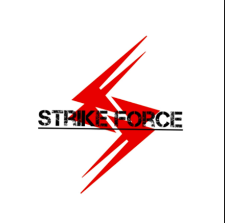 |
STRIKE FORCE | The team hasn’t seen much winning in SASL in their rookie year in 2018. However, we love their logo and team name. Their official team color is teal which always brings unique look to a softball team. Maybe their on field play catches up to their logo? |
| 6 | THE ONES | After a couple of years in purgatory, The Ones returned with vengeance and played for the championship in 2018. Their simple logo goes right the point and sometimes that’s the best way to go. Boring? Maybe. | |
| 7 | 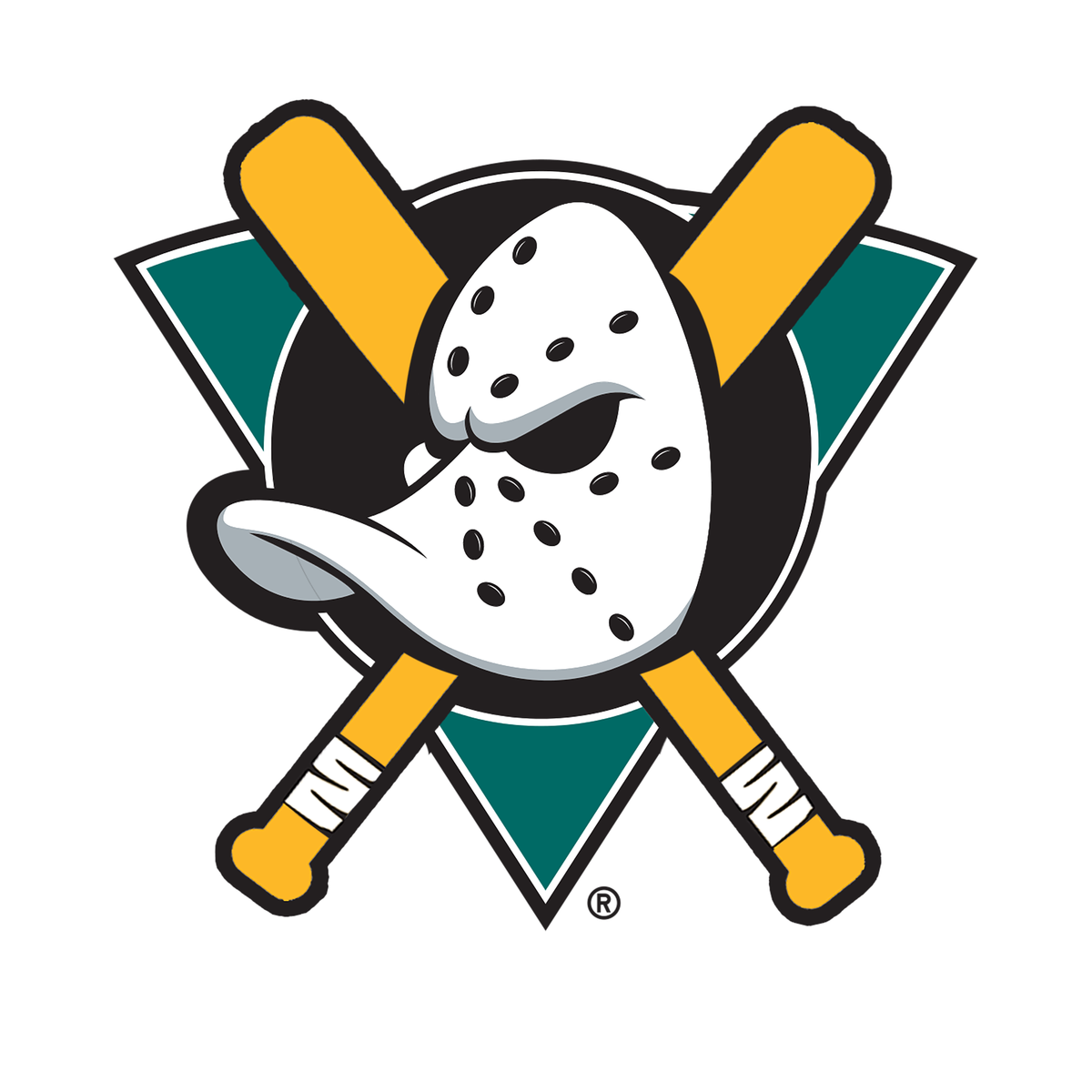 |
MIGHTY DUCKS | High points for a cool concept, low points for not doing something better with it. The Mighty Ducks logo may have been lower if not for their 2018 historic season. The brand is as strong as ever but their logo needs tweaking. |
| 8 | 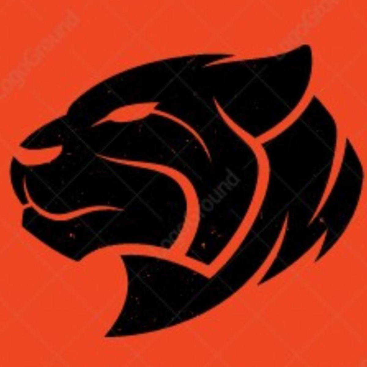 |
BENGALS | 2018, they had the NFL Cincinnati Bengals logo. Terrible. This year, they are under new management and are coming up with something a little better. You have one of the most ferocious animals in the planet as your team name, and this is the best you got? One step at a time tho… |
| 9 | HIT SQUAD | The 2018 National League champions, they have a perfectly acceptable logo and team name. Will anyone remember this logo if they ever fold? No. It is all about branding guys. | |
| 10 | NWO | **YAWN**. Only reason they aren’t last is because of their jerseys are absolutely FIRE and unique. | |
| 11 | 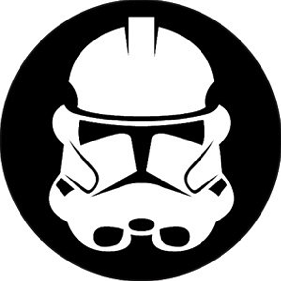 |
TROOPERS | This is a terrible logo. And still ranks 11th in our list. The rest are even worse. They could have done so many cool things with a Trooper name, but this logo isn’t one of them. |
| 12 | 516 | Were they penny pinching when they got someone to do this for them? Graphic artists can’t be that expensive. Someone really felt lazy. Good thing they are actually a good team on the field. | |
| 13 | 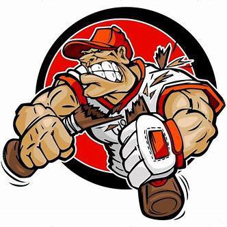 |
BATS | Breaking Bats logo of the past few years was one of our favorite. First you change your team name from Breaking Bats to ……. Bats. Then you compound that decision with this logo of a guy BREAKING bats? WHAT ARE WE MISSING? |
| 14 |  |
SHOOTER McGAVINS | Great logos mean something to the team or city, etc. Bad logos have a team name from an American movie and a logo from a completely different Bollywood movie. How does this make sense? One has nothing to do with the other. Neither has anything to do with Softball. Go figure! |
| 15 |  |
SCOOBIES FORCE | Their team name sounds creepy. Their logo looks like a lot of creativity went into it (sike!). Maybe they don’t care about how their team is portrayed? What is the antonym of swag? Scoobies Force. |